Your website visitors will decide in just over 1 and a half seconds if what they see has anything to do with what they were looking for. It is a proven fact. The science and techniques applied in this regard are more than demonstrated. And it is more than verified what does NOT work.
My previous post about how to layout an article to make it attractive and inviting to read.
When we look through a book or magazine, we read "diagonally." When we click on a link, whether from a search engine or social network, we no longer read: We look. We look “ultradiagonal”. Because the environment encourages impatience. Either because of loading times, or because of "straw" in the content. We do not have time. No one has it.
When we click on a link, whether from a search engine or social network, we no longer read: We look.
Of course we have time, and plenty of it. But No with a smartphone in hand. More time these days is spent watching hundreds of funny videos on TikTok than reading articles or news.
Always keep this in mind when deciding the contents of your website and how it is presented. Plan attention to each element, without making movies: On the Internet, if brief and direct, ten times good. As is well.
Tips to control the attention of visitors to our website, and elements to avoid
To begin with, something that is widely said and proven, but that many clients find difficult to understand: DO NOT use sliders either carousels at the top of your website. They force you to wait or interact between your slides, and hopefully it will be viewed 1 or 2.
If you sell HAMS, the H1 title of your page must contain the word “HAMS”, and not “The true taste of a great tradition”. Save poetry and literature for secondary places.
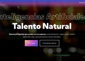
The header of the web page must contain a direct and specific text header related to the content (H1). It should NOT be a slogan. Use the tagline in a paragraph of text, and immediately add a CTA. This can be used OR NOT, but invites you to make a query, contact or view some rates. CUT TO THE POINT.
I have been in meetings with clients, wasting time and money - theirs and mine -, trying to decide the order of the slider elements, the photos, the contents... when no one was going to dedicate even half a second to it. bloody slider. It's like that. Choose a good, pleasant or illustrative image of your product or service, and one that coexists with the header text.
DON'T use long paragraphs of text, because NO ONE will read them. Create sections, and title them using H2 for sections, and H3/H4 for subsections or titles in listings.
- Create dotted lists of your services or products in a concrete way.
Alternate bold and different text sizes to prioritize the information, as I am doing here.
Add illustrations between the contents, these will help to graphically reinforce the messages.
Try to avoid tabs or accordions on main pages, these types of elements work more correctly on product or service detail pages, but not on landings, home pages neither distributors.
Use VIDEO. But use it wisely. The video retains its visitors, the audiovisual material is content for passive consumption, easy to "digest." But don't EVER make it mandatory. Let your visitor choose when to press PLAY.
Use some interactive graphic element. Something simple, a "before/after" image comparator, or a simple customizer, a bar graph... It doesn't have to be a big technical boast, just try to CONCEPTUALIZE your product or service, so that for your visitor involve only play a couple of seconds with the color buttons, the little arrow, something as jam possible.
It may seem silly, but nothing further; “microinteractions” or banners will enrich your visitors' experience. ROLLOVER and small effects are NOT nonsense. But be subtle. Don't turn your electronic headquarters into a cartoon.
DO NOT add ALL sections of your website to the top menu. Cut your menus to the maximum, ACCOMPANY your visitors. To show an index of all the contents of your website, you already have the footer (Footer) or create a specific page for it (web map).
If you go in to look in a store, it is normal for a clerk to come and ask you if you need help.
USE POP-UPS and pop-ups MODERATELY. These WORK, they really do, but they can be a real pain in the ass. If you go in to look in a store, it is normal for a clerk to come and ask you if you need help. You may have a question or just say thank you, but you're just looking. When an employee has already come, if another person comes back to ask you the same thing, they will probably start to feel annoyed. Once the customer is looking interestedly, if they want something they will go to the counter.
Use forms not only for your customers to contact you. Use them to get data from your customers and reward them with documentation downloads or small incentives. You can't imagine how well it works to offer the download of an exclusive PDF, or a small discount coupon for signing up for a newsletter!


